From Builder Basic to Custom Feel: How to Elevate a Standard Home Without a Full Renovation
Many newer homes — especially new builds — come with beautiful layouts, functional kitchens, and clean finishes. But they often share one common challenge: they can feel a little… standard. Builder-grade homes are designed to appeal to the masses, which means they often lack the warmth, character, and thoughtful details that make a home feel truly custom.
Many newer homes — especially new builds — come with beautiful layouts, functional kitchens, and clean finishes. But they often share one common challenge: they can feel a little… standard.
If you’ve ever walked into your home and thought it looks nice, but it doesn’t feel like me, you’re not alone. Builder-grade homes are designed to appeal to the masses, which means they often lack the warmth, character, and thoughtful details that make a home feel truly custom.
The good news? You don’t need a full renovation to elevate your space. With the right design decisions, you can transform a builder-basic home into one that feels layered, refined, and uniquely yours.
Here’s where I always recommend starting.
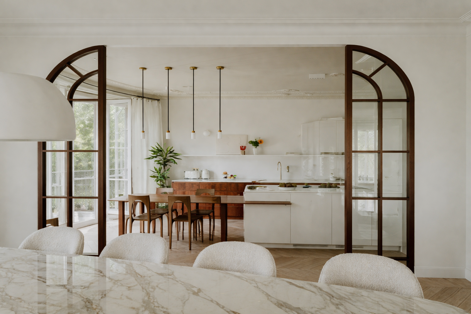
Start with Lighting: The Fastest Way to Elevate Any Space
Lighting is one of the most overlooked design elements in newer homes, yet it has one of the biggest visual impacts. Many builder-installed fixtures are chosen for function and cost efficiency, not for style or scale.
Swapping out standard light fixtures for statement pendants, elegant flush mounts, or sculptural chandeliers instantly adds personality and sophistication. Consider upgrading your dining room fixture, kitchen island pendants, and entryway lighting first — these are high-visibility areas that set the tone for the entire home.
Layering lighting is equally important. Adding table lamps, floor lamps, and under-cabinet lighting creates warmth and dimension, making the home feel curated rather than builder-basic.
Add Architectural Interest Without Major Construction
Custom homes often feel elevated because they include architectural details that builder-grade homes typically skip. The good news is that many of these details can be added without major construction.
Simple upgrades like wall moulding, picture-frame trim, board and batten, or a subtle feature wall can completely transform a room. Even something as simple as upgrading baseboards or adding a more substantial door casing can create a higher-end look.
In living rooms or primary bedrooms, consider adding a feature wall behind the bed or sofa using millwork, wallpaper, or a textured finish. These touches add depth and character while maintaining a timeless feel.

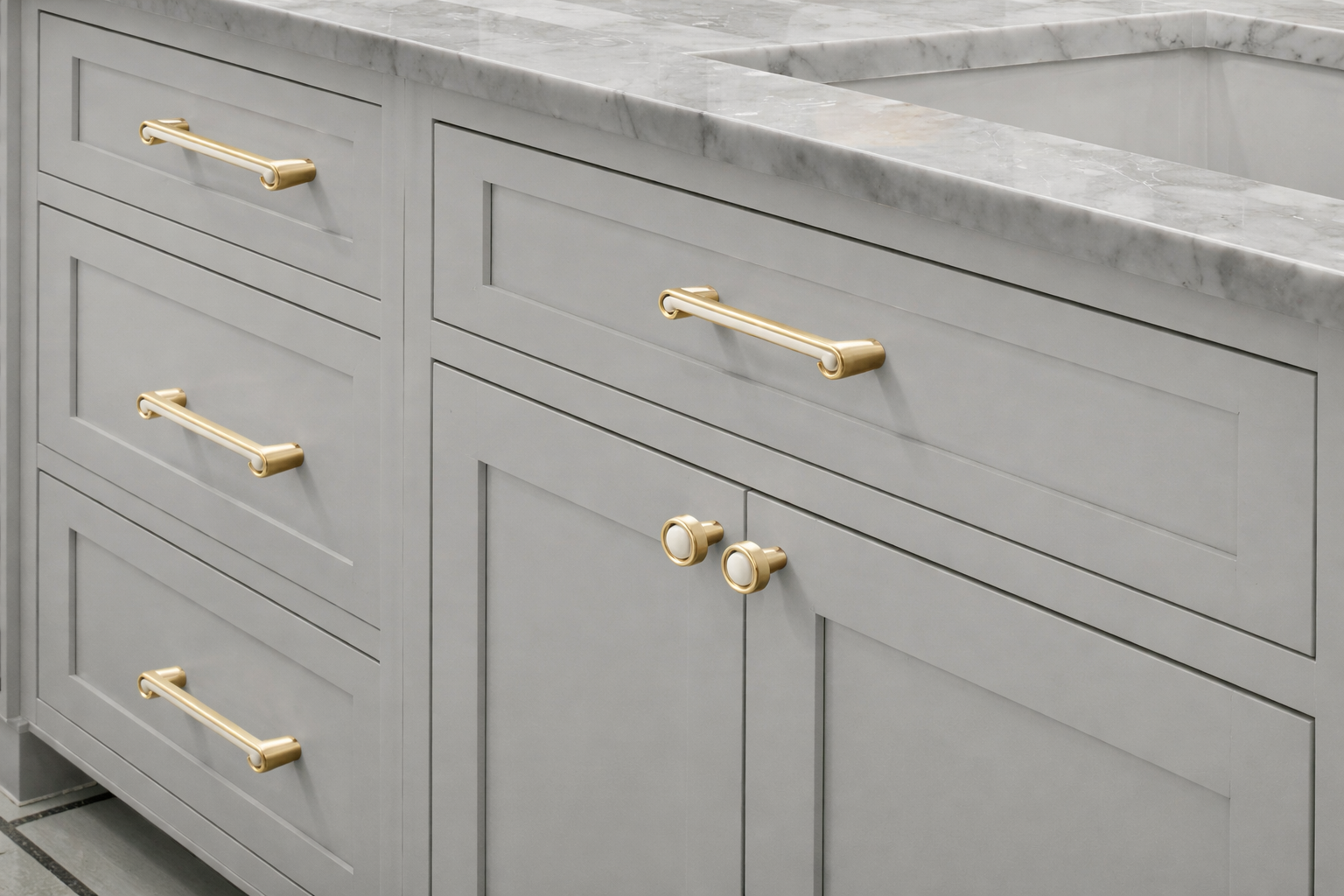
Upgrade Hardware and Plumbing Fixtures
One of the easiest ways to create a custom feel is by replacing builder-standard hardware. Cabinet handles, door hardware, and faucets may seem like small details, but collectively they have a powerful visual impact.
Swapping basic chrome or standard finishes for warmer metals or mixed materials can instantly modernize and elevate your home. Consistency is key — aim to keep finishes cohesive throughout the home so everything feels intentional and connected.
This is a relatively low-cost upgrade that delivers a high-end result.
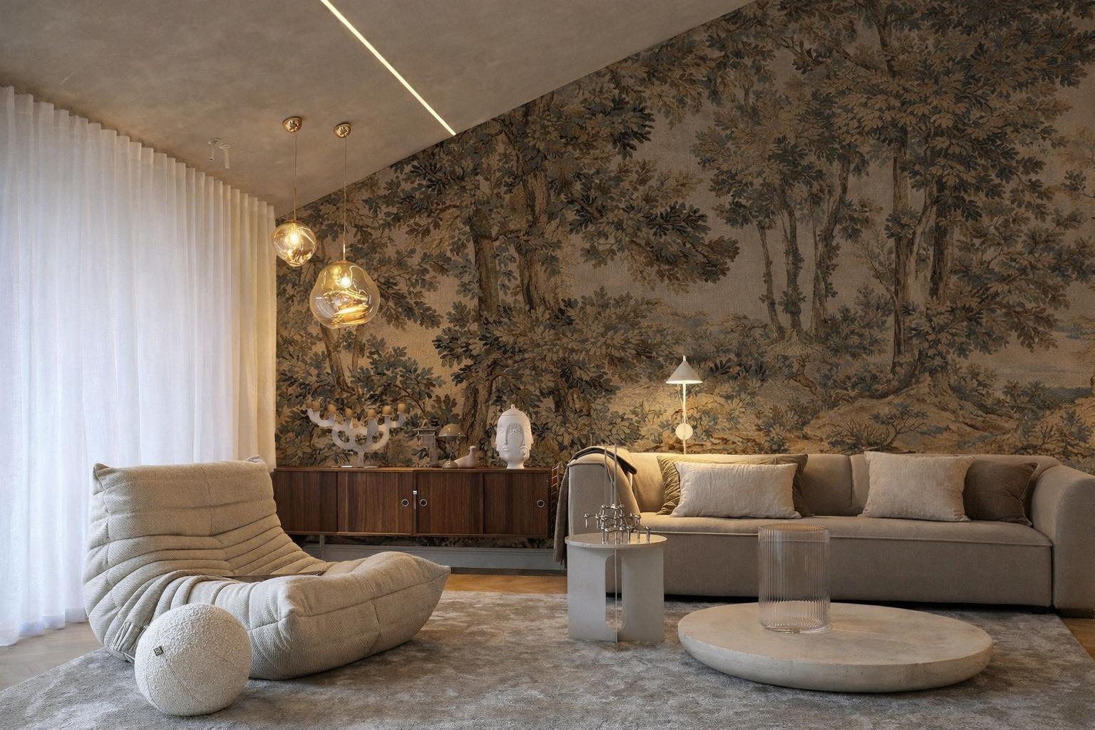
Introduce Warmth Through Texture and Layering
Many new builds feature smooth surfaces and minimal texture, which can make spaces feel flat or sterile. Introducing layered materials brings warmth and visual interest.
Think:
Soft area rugs to ground each space
Linen or textured drapery instead of basic blinds
Wood tones to add warmth and contrast
Accent chairs, pillows, and throws to soften clean lines
Texture is what transforms a home from “nice” to “inviting.” The goal is to create a space that feels lived-in and welcoming while still refined.
Create Custom Moments Throughout the Home
Custom homes often include thoughtful, intentional moments that feel tailored to the homeowner’s lifestyle. You can achieve this same feeling by focusing on a few key areas.
Consider adding:
Styled built-ins or floating shelves
A custom-feeling mudroom or entry drop zone
A reading nook or feature chair in an unused corner
Artwork or oversized mirrors to anchor main walls
These moments don’t require a full renovation, but they add personality and purpose — two things builder-basic homes often lack.
Focus on Cohesion from Room to Room
One of the biggest differences between a standard home and a custom-feeling home is flow. When finishes, colours, and materials feel connected from space to space, the entire home feels more intentional and elevated.
This doesn’t mean every room needs to be the same colour. Instead, aim for a consistent palette and design direction that carries throughout the home. Repeating similar tones, textures, and finishes creates visual harmony and a more polished overall look.
Final Thoughts
A builder-grade home is actually the perfect blank canvas. With the right design choices, it can be elevated into a space that feels warm, custom, and completely personal — without the cost or disruption of a full renovation.
Thoughtful lighting, upgraded details, layered textures, and a cohesive vision can transform a standard home into one that feels beautifully curated and uniquely yours.
If you’re living in a newer home and feel like it’s missing that custom touch, the solution often isn’t starting over — it’s making smarter, more intentional design decisions that bring the space to life.

Design Decisions Buyers Notice Immediately (and How They Impact Your Home’s Value in Winnipeg)
As the New Year begins, many homeowners start setting intentions for the year ahead—and in Winnipeg, a surprising number of those goals include a move in 2026. Whether you’re planning to list later this year or you’re simply being proactive, the design decisions you make now can directly influence how quickly your home sells and how strong your offers are when it hits the market.
As the New Year begins, many homeowners start setting intentions for the year ahead—and in Winnipeg, a surprising number of those goals include a move in 2026. Whether you’re planning to list later this year or you’re simply being proactive, the design decisions you make now can directly influence how quickly your home sells and how strong your offers are when it hits the market.
Winnipeg buyers are highly intuitive and value-driven. They care deeply about condition, comfort, and whether a home feels move-in ready—especially given our climate, seasonal market shifts, and competitive price brackets. Buyers often form an opinion within moments of walking through the door, long before they review features, square footage, or price. Those reactions are emotional first, logical second.
Understanding what buyers respond to subconsciously enables sellers to prepare strategically, positioning their home to sell faster and for top dollar.
The Emotional Impact of the Entry
The entryway sets the emotional tone for the entire home. Buyers subconsciously assess whether the space feels welcoming, intuitive, and calm. A clear path forward, balanced lighting, and a sense of openness allow buyers to relax rather than feel overwhelmed or unsure of where to go next.
When an entry feels cluttered, dark, or visually confusing, buyers carry that discomfort with them as they move through the rest of the home. Conversely, a thoughtfully designed entry builds instant trust and confidence—signals that the home has been well cared for and thoughtfully planned.
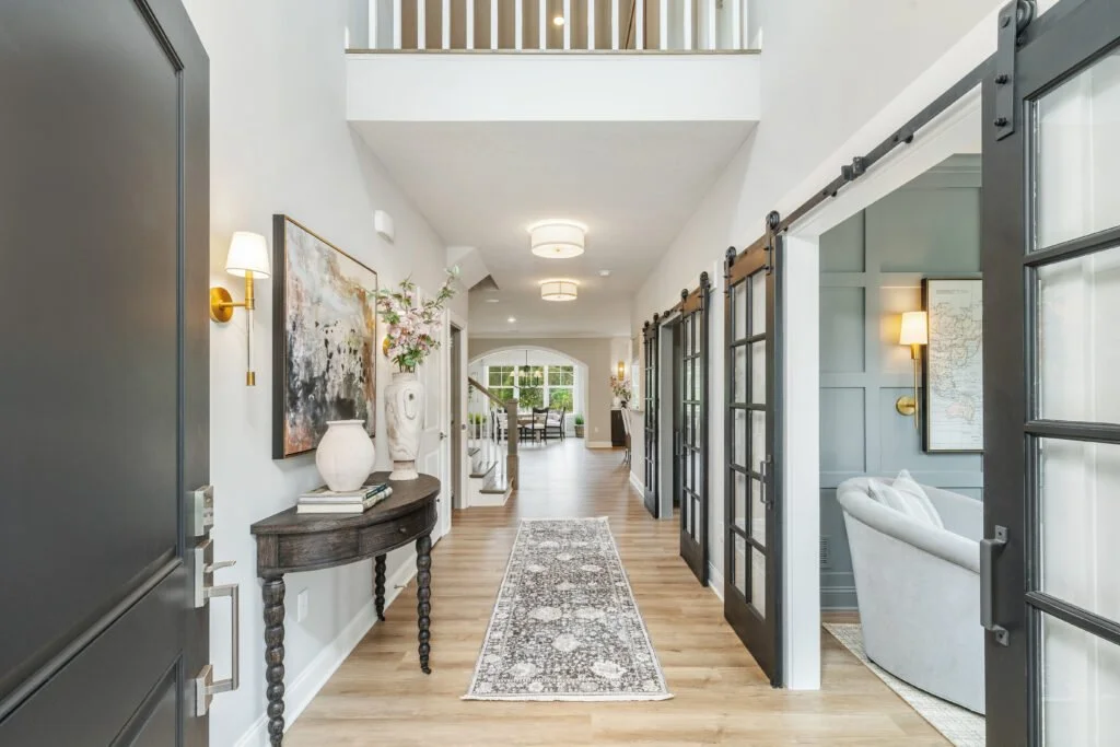
Source: Pinterest
Light: One of the Strongest Psychological Drivers
Light influences how buyers perceive almost everything—from cleanliness to ceiling height to overall mood. Bright homes are consistently perceived as larger, newer, and better maintained, even when the actual finishes are modest. Natural light is ideal, but layered artificial lighting is just as important.
Homes with only overhead lighting often feel flat or harsh. Thoughtful layering—ambient lighting for overall glow, task lighting for function, and accent lighting for warmth—creates depth and comfort. Equally critical is colour temperature: lighting that’s too cool can feel clinical, while lighting that’s too warm can skew dated. When lighting is balanced correctly, buyers simply feel “good” in the space without knowing why.
Flow, Movement, and Spatial Ease
Buyers instinctively test how a home functions by how it moves. Rooms that feel easy to navigate, furniture that’s properly scaled, and walkways that aren’t obstructed allow the brain to process the space effortlessly. This sense of ease is incredibly powerful.
When a home feels tight or awkward—even subtly—buyers often interpret it as a layout problem or assume the home won’t suit their lifestyle. In reality, it’s often a design issue, not a structural one. Proper spacing, thoughtful furniture placement, and visual breathing room make a home feel intuitive and livable.
Source: Banda Studio
Consistency Creates Confidence
Consistency in finishes, colours, and materials sends a strong subconscious message: this home was designed with intention. When buyers encounter too many competing styles or abrupt transitions, it creates visual noise that feels unsettling—even if each finish is attractive on its own.
Inconsistent design often leads buyers to assume there will be future work, hidden costs, or decisions they’ll need to undo. A cohesive palette and material story creates calm, reduces mental friction, and allows buyers to focus on the home itself rather than what feels “off.”
The Feel of Everyday Touchpoints
Buyers interact with a home constantly during a showing—opening doors, pulling drawers, turning faucets, flipping switches. These small moments matter more than most sellers realize. When these elements feel solid, smooth, and well-installed, buyers subconsciously register quality.
If hardware feels loose, fixtures feel lightweight, or doors don’t close properly, buyers begin to question the overall care of the home. Even if everything else looks beautiful, poor tactile experiences quietly erode confidence.
Source: Vuugu
Vertical Balance and Perceived Height
Ceiling height plays a larger role in buyer perception than actual measurements suggest. Even standard-height ceilings can feel taller or shorter depending on how the vertical space is treated. Window coverings hung too low, light fixtures that are improperly scaled, or heavy visual weight at eye level can compress a room.
When the eye is guided upward—through correctly placed drapery, balanced millwork, and thoughtful lighting—spaces feel more open and elevated. Buyers may never comment on ceiling height, but they absolutely feel the difference.
Colour That Supports Emotion, Not Distraction
Colour has a direct impact on how safe, calm, or overstimulated a buyer feels in a space. Buyers respond best to palettes that feel intentional, balanced, and timeless. Overly bold or trendy colours can create hesitation, while overly flat palettes can feel uninspired.
The goal is not to remove personality, but to create a backdrop that allows buyers to emotionally settle into the space. When colour supports the architecture rather than competing with it, buyers feel grounded and comfortable almost immediately.
Source: Pinterest
A Design Insight Most Sellers Overlook
Buyers don’t fall in love with features alone—they fall in love with how a home makes them feel. When design decisions reduce stress, improve clarity, and create comfort, buyers move through a home with confidence. That confidence often translates into stronger emotional attachment and, ultimately, stronger offers.
Good design works quietly. Its impact is felt long before it’s consciously understood.
Thinking About Selling in 2026? Here’s Your Next Step
If a move is on your 2026 vision board, now is the ideal time to start planning. Early preparation allows you to make strategic design updates, spread out costs, and position your home confidently—without last-minute stress or rushed decisions.
A proactive design and resale strategy can:
Help your home sell faster
Increase buyer confidence
Reduce negotiation friction
Maximize your final sale price
If you’d like guidance on how to prepare your home specifically for Winnipeg buyers—whether you’re six months or a year out—I’m happy to help you create a clear, value-driven plan that works for your timeline and goals.
Final Thoughts
The most effective design decisions aren’t flashy or trend-driven. They’re thoughtful, cohesive, and rooted in how people actually experience space. When design aligns with buyer psychology, homes don’t just show better—they feel better.
Whether you’re preparing to sell or simply want your home to function and flow at a higher level, understanding these subtle design cues allows you to make decisions that truly move the needle—both emotionally and financially.

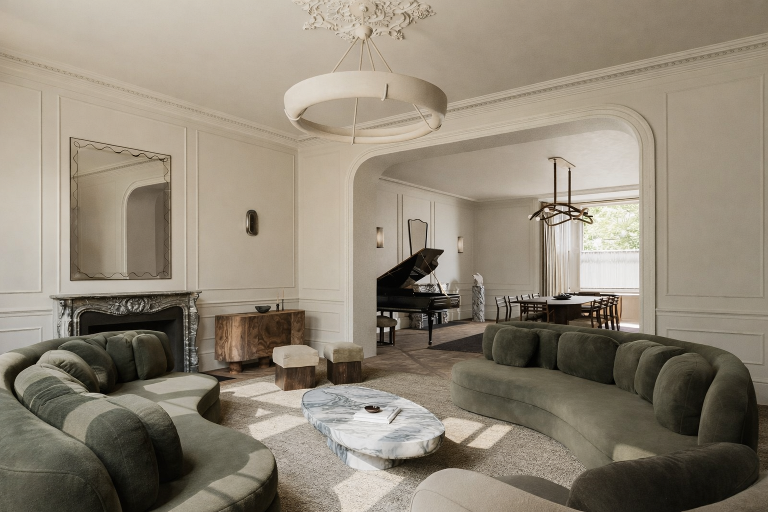
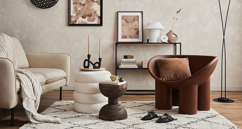
The Power of Texture: The Quiet Detail That Elevates Every Room
Texture is one of the most transformative tools in interior design, yet it’s also the element most often overlooked. Let’s take a look to see how we can utilize texture in interior design.
Texture is one of the most transformative tools in interior design, yet it’s also the element most often overlooked. We tend to search for the perfect paint colour or the right piece of furniture, but it’s texture that gives a room its warmth, depth, and lived-in beauty. When done well, it turns a space from “nice” into “you need to see this,” and it sets the tone for how a home feels from the moment you step inside.
In every project I take on — from full renovations to simple refreshes — texture plays a starring role. It’s the quiet detail that pulls a design together and makes even the most minimal spaces feel intentional and layered. And the best part? You don’t need a full remodel to use its power. Just a few thoughtful shifts can completely transform a room.
Why Texture Matters More Than You Think
Texture works on an emotional level. It’s what makes a home feel grounded, inviting, and lived in. Soft fabrics bring comfort; natural woods bring warmth; stone adds weight and authenticity. These subtle layers create a sense of balance that no single element can accomplish on its own.
Without texture, even the most beautifully styled space can feel flat or sterile. But when varied materials work together — think matte tile against a smooth countertop, boucle beside warm oak, or linen drapery softening modern lines — the space instantly feels curated and cohesive. Texture gives your eyes a place to land.

Source: Decorilla
How to Layer Textures Like a Designer
Texture becomes most powerful when you combine it with intention. Here’s how to weave it into any room with confidence:
Start With a Foundation Material
Begin with one grounding texture — a natural wood floor, a stone fireplace, a textured area rug — and let it anchor the rest of the room. This piece becomes the connective thread that guides all other material choices.
Mix Opposites for Balance
Pairing contrasting textures creates energy and dimension. Smooth with rough, matte with glossy, structured with soft. The contrast is what brings sophistication to the finished design. A velvet sofa against a ribbed sideboard or a matte kitchen backsplash beside polished hardware are perfect examples.
Use Textiles to Add Warmth
Textiles are the easiest and most budget-friendly way to introduce texture. Layering linen drapery, a knit throw, a jute rug, or oversized cushions instantly makes a room feel more inviting. Even in a clean, modern space, textiles soften the architecture without overwhelming the aesthetic.
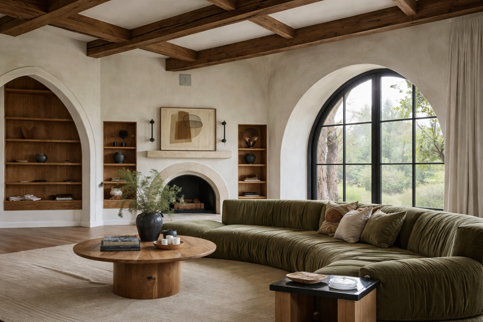
Don’t Forget Architectural Texture
Texture isn’t only about décor. Wall panelling, wainscotting, ceiling beams, reeded details, and natural stone add structural character to a home. These elements bring longevity and visual interest that stand the test of time — especially in transitional and Scandinavian-inspired spaces.
Source: Artiss
Let Lighting Do the Work
Lighting and texture go hand-in-hand. The right light sources can highlight ridges in tile, emphasize the softness of drapery, and cast subtle shadows that reveal depth you may not notice at first glance. Think warm sconces near textured art, pendants grazing the countertop, or sunlight filtering through sheer curtains.
Texture needs light to shine, and light needs texture to create atmosphere.
The Secret to Making Texture Feel Elevated, Not Busy
The key is restraint. You don’t need to overload a room with multiple textured elements to make an impact. Instead, aim for a curated mix of three to four materials that work together. When texture supports the overall story of the space — not competes with it — the result feels polished, harmonious, and timeless.
Source: Pinterest
Final Thoughts
Texture is far more than a design detail — it’s the layer that makes a house feel like a home. It creates comfort, sophistication, and emotional connection. Whether you’re transforming a single room or reimagining your entire space, weaving texture into your design is one of the most powerful ways to elevate your interiors.
If you’re planning a renovation or want to bring renewed depth into your home, I’d love to help guide you in creating a space that feels both beautiful and deeply personal.