
The 5 Interior Design Mistakes That Are Quietly Devaluing Your Home (and How to Fix Them)
The truth is, not all design is created equal. And while your home should reflect your personality, it should also be a space that grows with you and protects your investment.
As a real estate agent and interior designer, I’ve walked through hundreds of homes—some that stopped me in my tracks (in a good way), and others that made me think, “This could’ve been stunning… if only they’d made better design choices.” The truth is, not all design is created equal. And while your home should reflect your personality, it should also be a space that grows with you and protects your investment.
Whether you’re planning to sell soon or simply want to make smart design decisions, here are five common interior design mistakes that could be quietly chipping away at your home’s value—and how to fix them.
1. Overly Bold or Trendy Colour Choices
The Mistake:
A statement wall in magenta? A lime green kitchen? Bold colours have their place, but when they're plastered across large surfaces, they can overwhelm—and limit—your home’s appeal.
The Fix:
Opt for timeless, neutral backdrops and add personality through art, textiles, or accessories. Think soft whites, greige, taupe, or sage as a starting point. These tones photograph beautifully and appeal to a broader range of buyers, while still giving you flexibility to layer in bold accents.

Source: Time & Place Interiors
2. Cutting Corners on Finishes in High-Traffic Areas
The Mistake:
Using builder-basic or low-quality materials in kitchens, bathrooms, or flooring might seem like a budget saver, but they wear out faster—and it shows.
The Fix:
Focus your investment on the areas that matter most. Choose durable, mid-range (or better) options for countertops, tile, and flooring. Quality doesn’t always mean high-end; it means materials that last, function well, and elevate the overall look.

Source: Viva
3. Poor Lighting Planning
The Mistake:
Relying solely on one overhead light fixture (hello, dreaded boob light!) can leave your space feeling flat and uninspired.
The Fix:
Layer your lighting. Combine overhead lights with sconces, floor lamps, and under-cabinet lighting. It not only improves functionality—it adds depth, warmth, and that designer feel people instantly connect with.

Source: Kagu Design
4. Skipping Scale and Flow in Furniture Layout
The Mistake:
Too much furniture, pieces that are either oversized or too small, or awkward layouts that make a room feel cramped or disconnected.
The Fix:
Before buying anything new, measure your space and create a floor plan. Aim for breathing room around furniture, clear pathways, and layouts that invite conversation. When in doubt, less is more.

Source: Pinterest
5. Forgetting About Curb Appeal and Exterior Cohesion
The Mistake:
You’ve got a beautiful interior—but the exterior hasn’t seen love in years. Buyers might not even make it through the front door.
The Fix:
Update exterior paint, lighting, house numbers, and your front door colour. Make sure your landscaping is tidy and intentional. And where possible, ensure the design language of your interior and exterior flows—it creates a more cohesive and high-end impression.

Source: Pinterest
Final Thoughts: Design with Both Heart & Strategy
Your home should be a reflection of you, but smart design means thinking beyond today’s trends. If you’re ever unsure whether a design choice is adding value—or quietly taking away from it—I’d love to help. Whether you’re planning to renovate, sell, or simply love your space more, I’m here to guide you every step of the way.
Let’s chat about your next project—big or small. Your home should be both beautiful and a smart investment.

How to Choose the Right Colour for Every Room in Your Home
Choosing paint colours can feel overwhelming, but it doesn't have to be. The key to creating a space that looks beautiful and feels just right is to start with one simple question: How do you want the space to feel?
Choosing paint colours can feel overwhelming, but it doesn't have to be. The key to creating a space that looks beautiful and feels just right is to start with one simple question: How do you want the space to feel?
This emotional starting point is more telling than you think. Whether you're craving calm, creativity, energy, or warmth, colour plays a powerful role in shaping the atmosphere of a room. For example:
Soft neutrals and cool tones create a calming, restful vibe—ideal for bedrooms or quiet reading nooks.
Warm tones like terracotta or buttery beige evoke comfort and coziness—perfect for living rooms or dining areas.
Bold hues like navy, forest green, or charcoal can add drama, focus, or intimacy—great for home offices or powder rooms.

Source: SheerLuxe
Lighting Changes Everything
Once you've defined how you want the space to feel, the next step is understanding how lighting will affect your colour choice. Natural light shifts throughout the day, while artificial lighting (especially the difference between white/blue vs. warm/yellow bulbs) can dramatically change how a paint colour reads.
A crisp white might feel clean and airy in daylight, but turn stark and cold under cool-toned artificial light. Meanwhile, a soft grey might pick up purple or blue undertones you didn’t expect, depending on the time of day.

Source: DIYBUNKER
The Power of Undertones and Hues
Undertones are subtle, but they make or break a room. Beige with a pink undertone will feel completely different than a beige with a golden undertone. The same goes for greys, whites, or even bold hues—each colour family has variations that can steer the mood of the room in a different direction.
Don’t skip this part: always test 3-4 sample colours that you’re drawn to, and paint small patches on the wall. Live with them for a few days and observe how they shift with the light from morning to evening. What feels bright and clean at noon might feel shadowy and cool by dinnertime.
Swatch Cards vs. Reality
Swatch cards are a great starting point, but the way a colour appears on a 2-inch sample is completely different from how it will feel when it's taking up an entire wall. Once painted on the wall, you'll get a much better sense of scale, depth, and undertone.

Source: Better Home & Garden
Bonus Tips for Choosing the Right Colour:
Use large-format peel-and-stick samples if available—they’re more accurate and easier to move around.
Hold your colour samples next to key elements like flooring, cabinetry, and countertops.
Don’t forget the ceiling and trim—choosing complementary tones here can elevate your entire scheme.
When in doubt, go a shade lighter than you think you need. Colour intensifies once it covers a full room.
Choosing the right paint colour is about more than just picking what looks good in the store. It’s about understanding how colour interacts with light, mood, and materials. By taking the time to sample and observe, you'll end up with a home that not only looks stunning, but feels just right.
Designing with Intention: 2025 Interior Design Trends That Inspire
Because your home should feel like you—not just look good.
Design isn’t just about aesthetics—it’s about how your home makes you feel. And in 2025, we’re seeing a beautiful shift away from trend-chasing toward more personal, intuitive, and soulful interiors.
Because your home should feel like you—not just look good.
Design isn’t just about aesthetics—it’s about how your home makes you feel. And in 2025, we’re seeing a beautiful shift away from trend-chasing toward more personal, intuitive, and soulful interiors.
Whether you’re considering a major renovation or simply refreshing a corner of your home, this year’s trends are all about slowing down, curating with intention, and creating spaces that nourish your life.
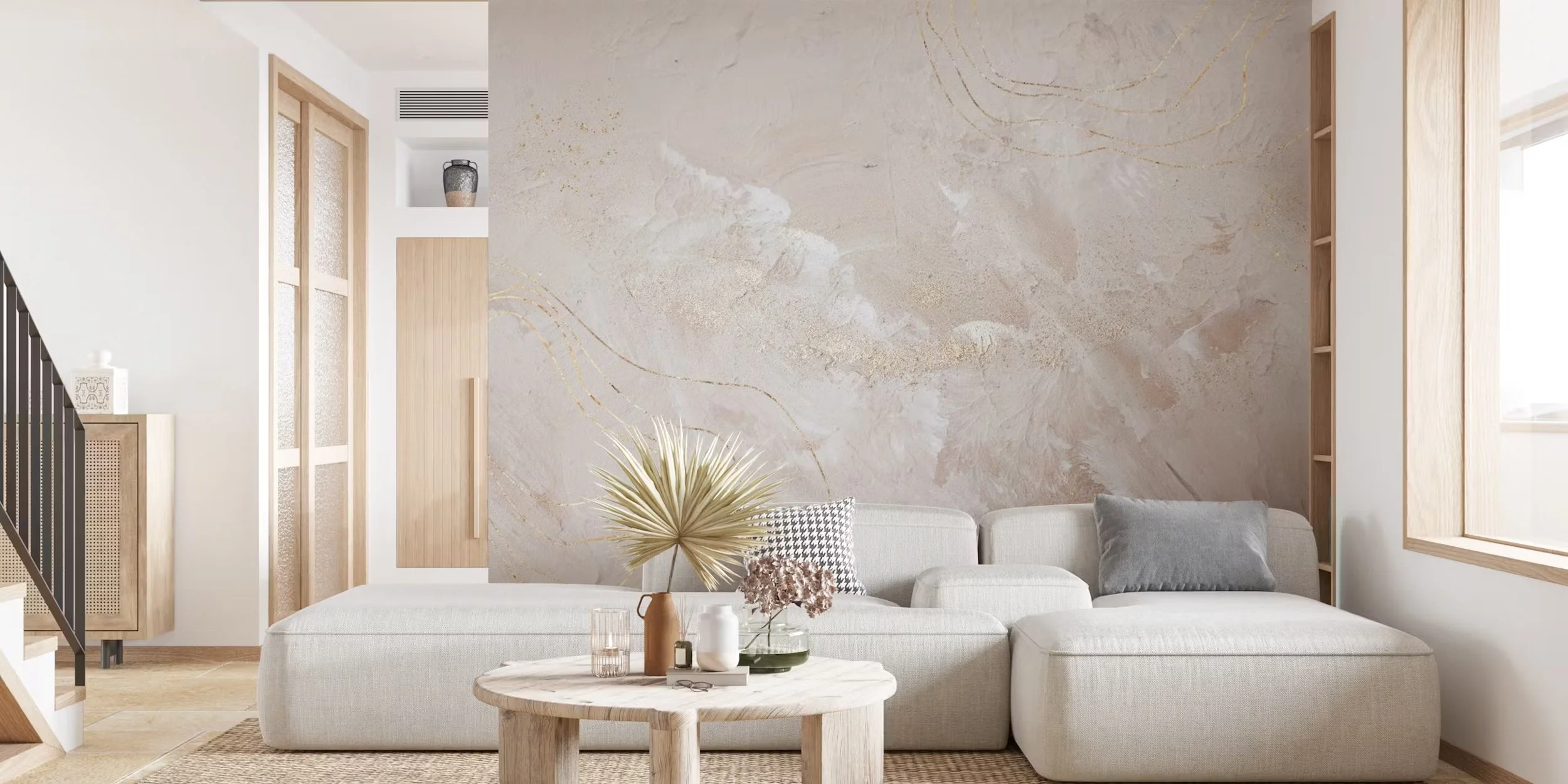
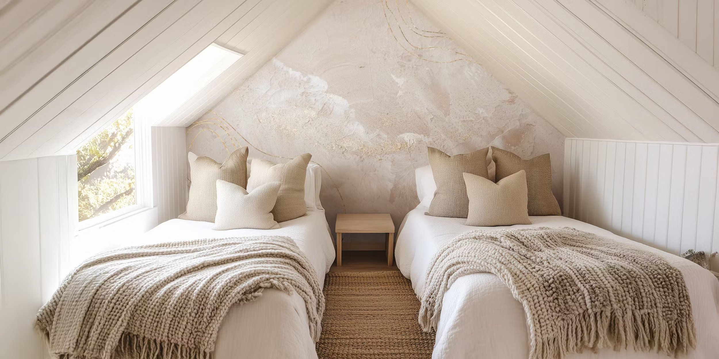
Earthy Tones + Layered Neutrals: Colour That Grounds You
In 2025, colour is being used more intentionally. We’re seeing warm clay, muddy olive, dusty lavender, and sun-washed ochres take over in favour of cool greys and stark whites.
Why it matters: These tones echo the natural world—helping you feel rooted, relaxed, and more connected to your space.
Unexpected ways to incorporate it:
Paint your ceiling in a muted, complementary neutral—it creates a cocooning effect, especially in bedrooms.
Layer tones instead of choosing a single ‘accent’—for example, sand-coloured walls, a camel-coloured sofa, terracotta floor pots, and caramel-toned drapes.
Introduce colour through textured materials: suede, velvet, ceramic, and matte limewash—rather than shiny painted surfaces.
Design Tip: When working with earthy tones, depth matters more than brightness. Stick to muddy or chalky finishes for a more sophisticated, calming vibe.

Source: Pinterest
Texture Is the New Pattern: Designing for the Senses
Texture tells a story where pattern once did. Instead of busy prints, we're seeing spaces come alive through touch: fluted wood, limewashed walls, boucle upholstery, cane panels, handmade tile, and aged metals.
Why it matters: Texture invites you to slow down. It makes a room feel tactile, soulful, and intentionally layered—even when the palette is neutral.
Unexpected ways to incorporate it:
Use ribbed or grooved wall panels in a powder room or hallway—they elevate with minimal effort.
Consider a handmade, imperfect tile for a kitchen backsplash—it adds movement without relying on colour.
Layer three types of textiles in one room: think wool, linen, and leather. It adds warmth without visual clutter.
Design Tip: Treat ceilings and lighting as texture opportunities too. A plaster-finished ceiling or a woven pendant can dramatically shift the mood of a space.
Source: Happy Wall
Design with Depth: Blending Past and Present
We’re embracing a more collected, meaningful aesthetic this year. Homes are moving away from matchy sets and toward curated layers that tell your story. Think vintage lighting with modern cabinetry. An heirloom dresser with a fresh coat of paint. A weathered stone table with clean-lined seating.
Why it matters: Mixing eras and materials brings soul into a space. It helps your home feel lived-in and loved—not staged or showroom-perfect.
Unexpected ways to incorporate it:
Repurpose old items in new ways: a vintage sewing table as a vanity, or an antique frame turned into a bulletin board.
Blend finishes: warm brass with matte black, polished nickel with aged copper. Don’t over-coordinate.
Create a gallery wall with a mix of thrifted frames, personal photos, and original art—it doesn’t need to be symmetrical, just intentional.
Design Tip: Choose one piece in each room with patina or a story—it adds quiet drama and character that trends can’t replicate.

Source: Places in the Home
Curves That Comfort: The Rise of Gentle Geometry
Soft, sculptural forms are showing up in everything from furniture to architecture: arched doorways, waterfall edges, scalloped details, and even organically shaped rugs.
Why it matters: Curves subconsciously tell our nervous system we’re safe. They're reminiscent of nature—stones smoothed by water, winding forest paths, the arc of a branch.
Unexpected ways to incorporate it:
Swap traditional bookshelves for ones with rounded corners or asymmetrical shelving.
Reframe an opening with an arch or soft curve (painted or drywalled).
Opt for a wavy headboard or a mirror with a rippled edge—it softens the entire space, especially in rooms with sharp angles or boxy architecture.
Design Tip: Pair curves with structured materials (like steel or natural stone) for balance. Think: a boucle chair next to a raw travertine side table.

Source: Pinterest
Your Home = Your Retreat: Wellness-Centred Interiors
This year, design isn’t just about the ‘look’—it’s about how a room supports you. From micro-moments of peace to larger lifestyle shifts, wellness is at the forefront of 2025 interiors.
Why it matters: Your home should regulate your nervous system. It should offer pause, presence, and restoration. Not just more to maintain.
Unexpected ways to incorporate it:
Add dimmable task lighting and warm bulbs to create mood flexibility (and help with melatonin production at night).
Incorporate scent layering: use essential oils, incense, or candles in different zones. Lavender and cedarwood in bedrooms; citrus and rosemary in kitchens.
Use sound intentionally: small indoor fountains or ambient playlists can shift how a room feels emotionally.
Design Tip: Don’t underestimate the power of micro-zones—a single chair with a throw in a quiet corner, a grounding mat near a window, a basket of tactile objects or journals. Wellness isn’t a spa—it’s a lifestyle, integrated.

Source: Pinterest
So… What’s Fading in 2025?
Trends come and go—but here’s what’s being left behind this year:
All-white kitchens & stark minimalism: Warmth and lived-in luxury are in.
Mass-produced fast furniture: Clients want quality, story, and longevity.
Overly maximalist, chaotic prints: Texture and tone are leading the charge instead.
The “Pinterest copy + paste” look: Individuality is the new luxury.
Design with Intention, Not Imitation
This year, the most beautiful homes are the ones that reflect who you are. Not just who you're trying to impress. So here’s your design invitation for 2025:
Start with how you want to feel, not just how you want the room to look.
Don’t be afraid to mix old and new, imperfect and polished.
Choose fewer, better pieces that speak to you—let them tell a story.
Prioritize comfort. Joy. Calm. Connection. Then layer in style.
Final Thoughts: The Real Trend Is You
If there’s one design truth this year, it’s this: your home should be a reflection of the life you’re building—not just the mood board you pinned.
So choose what feels good. Honour what matters. Create with care.
Because when your home holds space for you, everything else—from your routines to your relationships—feels a little more supported.